Most web developers have come across the need for an input control that allows the user to select one or more options. The traditional advice is to use the <select> element with the multiple attribute. But this requires the user to hold down Ctrl in order to make more than one selection. If there is also scrolling to be done, then this can quickly become problematic for the end-user.
In this article, we discuss a couple of alternatives to solve this usability concern, depending on how long is the list of options to choose from. In all cases, the goal is backwards compatibility, full accessbility, and ease of deployment.
List of checkboxes#
When the size of a list is small enough, consider using checkboxes in a list instead of the <select> element. This is by far the best replacement to make: it is completely backwards compatible, is just as accessible, requires no external tools, and the form processing logic remains identical.
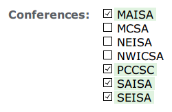
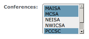
With some clever CSS, it is possible to hide the checkboxes themselves (using the visibility property, not display). And with just a bit more CSS, the same list of checkboxes can be made to look almost identical to the native <select> element, but without requiring the use of Ctrl to select more than one.
Here are two renditions of this technique:


Implementation#
We leave it as a fun exercise for the user to figure out how to implement the results shown above. A helpful hint is to look at adjacent and attribute selectors in CSS.
Source/target element#
The list of checkboxes technique works well when the list of items is sufficiently small, as in the example above. But what if the list of items is significantly longer? In this section, we would like to present a strategy we developed to address this issue.
Functional requirements#
We wanted a solution that allowed us to maintain the same HTML structure and content. We sought to create a Javascript file that would transform the dull and cumbersome multiple-<select> element into the more useful form control shown below:
Normally, we would be reticent to recommend a pure Javascript solution to a problem. However, in this case, the drop-in Javascript file is used to enhance existing functionality. Users browsing without Javascript will still be able to use the normal <select> form. Essentially, the page degrades gracefully.
The UI explained#
The user-interface is fairly familiar to most computer users. On the left is the "source" list. Items chosen from that list may be promoted to the "target" list on the right by using the buttons that separate the two lists. Items on the "target" list are the chosen items that will get submitted with the form. An item may exist in either one, but not both, lists.
To further aid the user, a filter box is provided above each list. Each box has a listener for the onkeyup event which will hide every option that does not contain the value being searched.
In addition, it is possible to double-click on an option in either list to trigger the promotion or demotion of an item. Finally, both lists are still, technically, <select> elements with the multiple attribute set, so it is still possible to select more than one entry from either list at a time.
Technical specifications#
The best way to learn is to try. Download mselect.js and follow along the discussion below. Because this is a stand-alone Javascript file, it does not require any external Javascript libraries (like jQuery, and company). It is "optimized" for standards-compliant browsers. Recall that the purpose of the script is to enhance the user experience. A user that chooses to navigate with non-compliant versions of Javascript has no more right to complain than one who chooses to browse without Javascript altogether.
The OWSMultSelect object#
The file describes one Javascript object, named OWSMultSelect. The constructor will accept as argument a <select> element (formally known as a HTMLSelectElement), and skin it by embedding it in the following tree structure:
- <DIV wrapper>
- <DIV sourceCell>
- <INPUT sourceFilter>
- <SELECT> (original element)
- <DIV buttonCell>
- <DIV targetCell>
- <INPUT targetFilter>
- <SELECT target>
- <DIV chosenOptions>
- <DIV sourceCell>
Of particular importance is the last entry in the targetCell: an element dubbed chosenOptions which contains a list of <input> entries with the value of the options that have been promoted to the target list.
In essence, the orignal <select> element is stripped of its name, which is then assigned to the <input type="hidden"> elements that are created or deleted as options are promoted or demoted.
The last bit of the mselect.js file adds an onload listener to the window object in order to transform every <select> element in the page. It is here that the developer may well opt to change the logic to only apply to elements of a certain length, or to ones that have a specific class, etc.
Advantages#
The main advantage of this script is that it is a self-contained, drop-in method to enhance an already-functional form input with one that should be both familiar and intuitive for most computer users. This makes it extremely easy to deploy in any application, while still being highly customizable.
Using the script#
In the spirit of open source, anyone is free to use mselect.js in any project. You are free to extend it, modify it, bundle it, or distribute it. You are only asked to maintain attribution at all times. The script is provided under the terms of the GPLv3 license.
Continue the discussion on Twitter. Follow @OpenWebSolns